- 최신 이벤트 + 웨비나 소식
- 팬톤코리아 고객센터 02-597-4577
- pantone@imd.kr
-

-
 국가를 선택하세요
AMERICAS
EUROPE
ASIA PACIFIC
-

-
 0
총 금액 :0
Pantone Color of the Year 2022 / Tools for Designers

The Pantone Color of the Year 2022 can be found in the following color systems:
-
COTTON (TCX)
PANTONE®
17-3938 TCX
Very PeriCROSS REFERENCEPrint PANTONE 17-3938
Very Peri using best cross
reference from the Pantone
Matching System (PMS):PMS SOLID COATED (INK)
INSPIRATIONAL
MATCHPANTONE®
2366 CBEST MATCHPANTONE®
2116 C -
COLOR VALUES
Visit Pantone Connect to get free digital access to PANTONE 17-3938 Very Peri, PMS cross references, and equivalent values for sRGB, Hex/HTML, CMYK, and L*a*b*.
DESIGN WITH VERY PERI


More than 10 million designers and producers around the world rely on Pantone Products and Services to help define, communicate and control color from inspiration to realization—leveraging advanced X-Rite technology to achieve color consistency across various materials and finishes for graphics, fashion, and product design. Pantone Standards feature digital and physical color specification and workflow tools. Read on to learn more about applying the Color of the Year 2022 across various industries, determine color values across our color systems, explore palettes and color harmonies, and more.
USAGE 2022 marks the first time a color has been custom created for the Pantone Color of the Year program. PANTONE 17-3938 Very Peri blends the faithfulness and constancy of blue with the energy and excitement of red to introduce an empowering mix of newness to apparel, beauty, home furnishings, product design, and packaging.
-
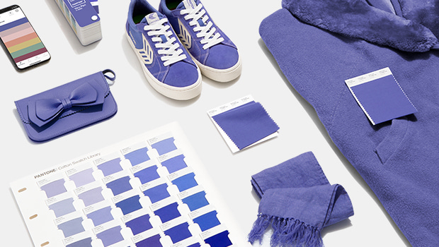
Very Peri in Apparel and Fashion Accessories
PANTONE 17-3938 Very Peri, a warm and friendly blue hue with a carefree confidence and joyful attitude, emboldens uninhibited expression and experimentation. This enthusiastic blue hue displays a dynamic presence and a whimsicality that lends itself to unpredictable color harmonies and spontaneous color statements. Futuristic in feeling, PANTONE 17-3938 Very Peri takes on distinct appearances through application to different materials, finishes, and textures, from shimmery metallics, lustrous sheens, and high-tech materials, to hand-crafted looks and natural fibers.
SHOP Tools for Fashion Design -
Very Peri in Beauty
Suggestive of personal inventiveness and daring imagination, PANTONE 17-3938 Very Peri makes a novel statement for eyes, nails, and especially hair when used in a variety of finishes and applications, from glittery and glam, to dusty matte.
SHOP Tools for beauty 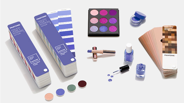
-
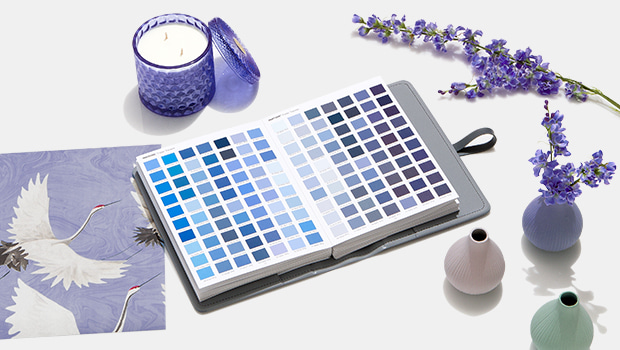
Very Peri in Home Décor
Evocative of a new modernity, PANTONE 17-3938 Very Peri injects a sense of playful freshness into home interiors, enlivening a space through unusual color combinations. A versatile shade that animates our creative spirit, PANTONE 17-3938 Very Peri is suited to an array of different materials, textures, and finishes, providing a pop of color whether introduced through a painted wall, statement furniture or home décor, or acting as an intriguing and eye-catching accent in a pattern.
SHOP Tools for home décor -
Very Peri in Packaging and Multi-Media Design
Fusing together the constancy and continuity of blue with the energy and excitement of red, PANTONE 17-3938 Very Peri conveys a message of credibility as well as creativity. Whether appearing in a fantasy digital realm or in physical materials, PANTONE 17-3938 Very Peri exudes a good-natured warmth that quickly engages the eye, making it an ideal shade for many applications of graphic and multi-media design, as well as packaging.
SHOP Tools for graphics 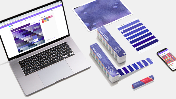

![팬톤 포뮬러 가이드 코팅, 비코팅 l GP1601B[PANTONE FORMULA GUIDE l Coated & Uncoated]](http://pantone.kr/web/product/medium/202211/4a7c973e9ca5908d5fb19fef3280e56b.jpg)
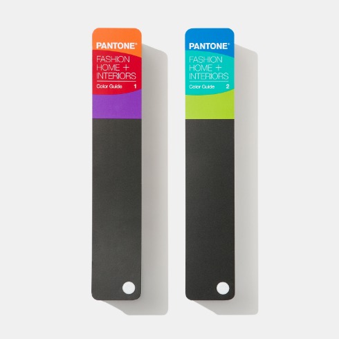
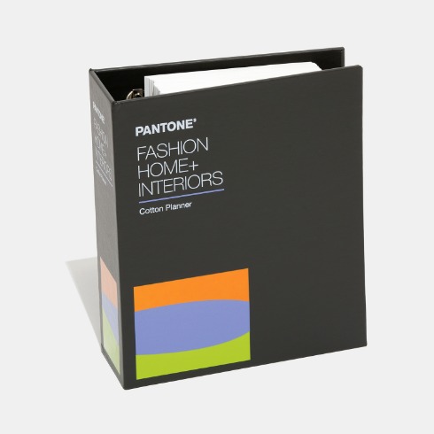


![올해의 컬러 2024 한정판 팬톤 포뮬러 가이드 코팅,비코팅 l GP1601BCOY24[PANTONE FORMULA GUIDE l Coated & Uncoated]](http://pantone.kr/web/product/medium/202401/8eae860a6ffde44c1c19af151e076d64.jpg)
![올해의 컬러 2024 한정판 팬톤 TPG 컬러 가이드 l FHIP110COY24 [PANTONE FASHION, HOME + INTERIORS Color Guide]](http://pantone.kr/web/product/medium/202401/ff7f249d46ee3f0acfe5c674babf1980.jpg)
![★ 팬톤 TCX 코튼 스와치 카드 - 올해의 컬러 2024 (부가세별도)[THE DEFINITIVE COLOR STANDARD FOR COTTON]](http://pantone.kr/web/product/medium/202401/c44b09557c41a6bdacecdb088a79a776.jpg)
![PANTONE 팬톤 TPG 라지 페이퍼 스와치 - 올해의 컬러 2024 / TPG-SHEETS[TPG Sheets]](http://pantone.kr/web/product/medium/202401/946617cc1bf7ddde4e669e4c1bfff8fc.jpg)

