![팬톤 포뮬러 가이드 코팅, 비코팅 l GP1601B[PANTONE FORMULA GUIDE l Coated & Uncoated]](http://pantone.kr/web/product/medium/202211/4a7c973e9ca5908d5fb19fef3280e56b.jpg)


.jpg)
.jpg)
.jpg)
Prominent Colors
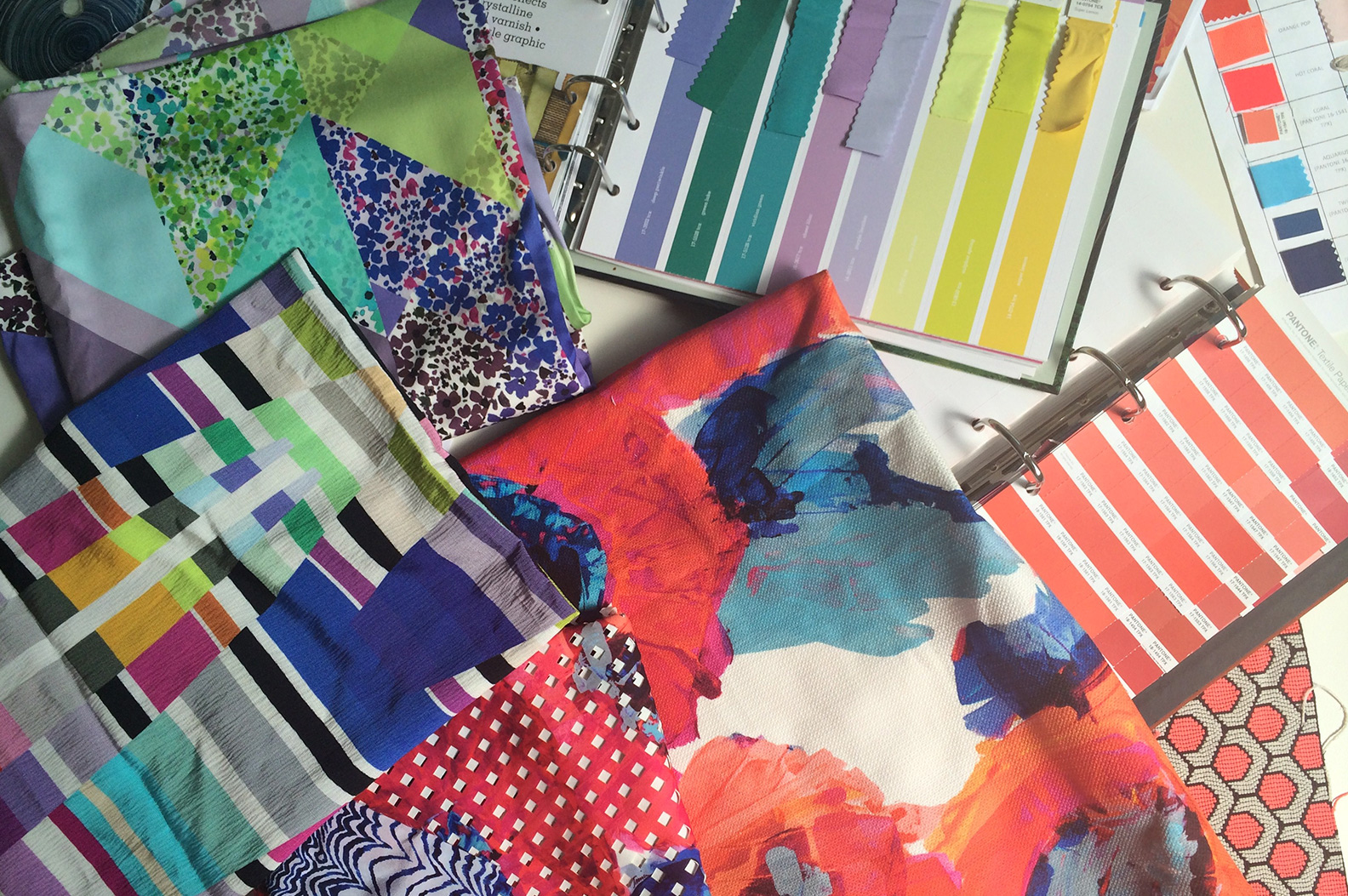
We’re using tonal combinations of an Orange-y Red, we’re calling Red Hot, Coral, with bright, almost Neon Orange pop, contrasted with Aquarius and Blueprint Blues. We are also using Spearmint, Limeade and Lilac combinations in another grouping of floral prints.
Inspiration
Our vibrant palette is inspired by the LA Flower Mart—lush flowers and foliage in a decidedly non-glamorous setting that includes generic, sometimes neon signage, and the utilitarian “tools” of a working flower market. Precious, exotic blooms from all over the world contrast with kitschy, pre-arranged bouquets tinted by the sheer hues of their cellophane wrappings.
Signature Colors
Red Hot is our most important color because it is key in our “Poppy” print, which the collection revolves around.
Must-have Item For Spring 2015
A one piece—either a romper or jumpsuit, in a print or solid color. It is Red Hot or Whitewash, a White that is just a few shades more creamy than Optic White.
How has the growing acceptance of seasonless color impacted or inspired your design and color choices?
Our customer demands color year round, so we always incorporate bright, clear color in all collections.