![팬톤 포뮬러 가이드 코팅, 비코팅 l GP1601B[PANTONE FORMULA GUIDE l Coated & Uncoated]](http://pantone.kr/web/product/medium/202211/4a7c973e9ca5908d5fb19fef3280e56b.jpg)


.jpg)
.jpg)
.jpg)
Prominent Colors
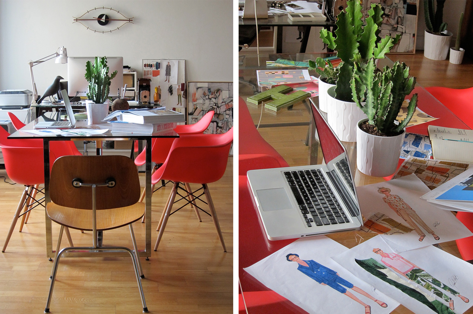
A combination of rich earthy tones and nostalgic pastels. We are combining colors like rich Terra Cotta, Bordeaux, Oregano, and New Indigo with Dusty Pink, Seafoam, Butter Yellow, and Pistachio.
Inspiration
The natural landscape of Palm Springs along with the colors used in the Modernist architecture. We pulled colors from the color photography of Julius Schulman and our Yellow was picked by matching the curtains of the Albert Frey house in Palm Springs.
Signature Colors
Dusty Pink. The color is present throughout the collection in solid linen, mohair, and incorporated into our atomic and desert landscape yucca prints.
Must-have Item For Spring 2015
Our linen suit – We are offering it in Dusty Pink, New Indigo, Seafoam, Terra Cotta, and Bordeaux.
How has the growing acceptance of seasonless color impacted or inspired your design and color choices?
I've always used color in my collection. I think what makes my collection special is our use of color and how we use it unexpectedly. I love using darker colors in spring by pairing them with lighter crisper fabrics and doing the opposite in fall.