- 최신 이벤트 + 웨비나 소식
- 팬톤코리아 고객센터 02-597-4577
- pantone@imd.kr
![팬톤 포뮬러 가이드 코팅, 비코팅 l GP1601B[PANTONE FORMULA GUIDE l Coated & Uncoated]](http://pantone.kr/web/product/medium/202211/4a7c973e9ca5908d5fb19fef3280e56b.jpg)


What Are Pantone Color Systems?
Pantone provides a universal language of color that enables color-critical decisions through every stage of the workflow for brands and manufacturers. More than 10 million designers and producers around the world rely on Pantone products and services to help define, communicate and control color from inspiration to realization – across various materials and finishes for graphics, fashion and product design. To learn more about our history, see About Us.
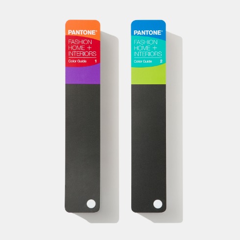
WE HAVE TWO COLOR SYSTEMS – THE PANTONE MATCHING SYSTEM (PMS), AND THE PANTONE FASHION, HOME + INTERIORS (FHI) SYSTEM
Why two?
A. Different needs . Each system is designed to feature market-relevant colors. Fashion designers need more whites, blacks, and neutrals in their palette, while print and packaging designers need colors that will pop on shelf.
B. Different materials . The appearance of color can change based on the material on which it is produced. In fact, some colors are not achievable at all on a certain material. Having two systems helps to ensure that the colors included are achievable and reproducible based on the materials used.
All of our color libraries are highly curated and backed by scientific achievability to meet market and manufacturing needs. Our systems are globally available,
so when a designer in New York City specifies a certain Pantone Color Number, the manufacturer in Shanghai immediately knows exactly which color they want
– and how to achieve it. Even though they may not speak the same language, they both understand the global colors of Pantone.

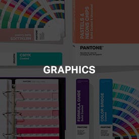
For Graphics
USE THE PANTONE MATCHING SYSTEM (PMS)
Available in the following formats:
![]()
![]()
GOOD FOR:
Print
Packaging
Digital
Screen Printing

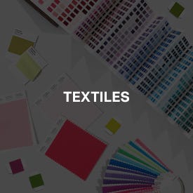
For Textiles
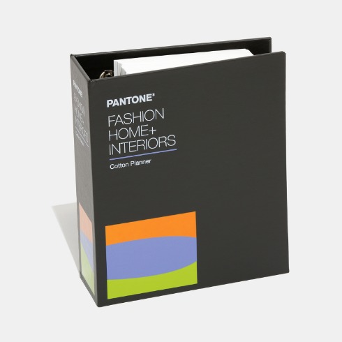
USE THE FASHION, HOME + INTERIORS (FHI) SYSTEM
Available in the following formats:
![]()
GOOD FOR:
Apparel
Fabrics
Soft Goods

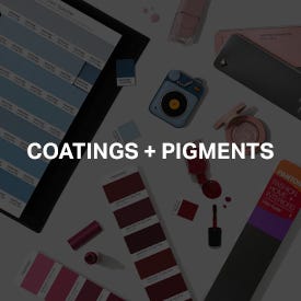
For Coatings & Pigments
USE THE FASHION, HOME + INTERIOR (FHI) SYSTEM
Available in the following formats:
![]()
![]()
GOOD FOR:
Cosmetics
Paints
Leather
Accessories
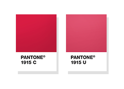
DID YOU KNOW THAT OUR GRAPHICS COLOR SYSTEM USES UNIQUE CODING?
When you see the words "PMS" you are using the graphics system.
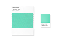
DID YOU KNOW THAT OUR FASHION, HOME + INTERIORS SYSTEM USES UNIQUE CODING?
"TCX" references textiles, while "TPG" references pigments and coatings.
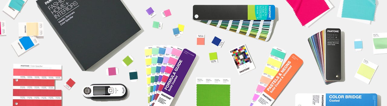
DIGITAL SOLUTIONS FOR PANTONE COLOR SYSTEMS
To complement physical color matching and selection, Pantone offers a full suite of software and devices that make designing with Pantone a simple physical to digital process.
YOUR PANTONE COLORS, EVERYWHERE.
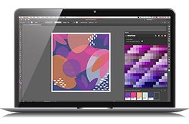
Pantone Connect is a platform that provides designers with access to digital Pantone Colors and helpful color features across mobile, web, and design applications in Adobe® Creative Cloud®.
Pantone Connect helps designers to streamline their color selection, color communication, and design process to improve accuracy and reduce time time/rework. This includes matching physical color samples to Pantone Colors, creating and arranging palettes for design projects, and applying Pantone colors to design files.
WHY ARE COLOR STANDARDS IMPORTANT?
A brand’s color is critical to its identity – creating associations and expectations, triggering mental images and memories. Studies show that the right color can increase brand recognition by up to 87%.
In product development, the right color is the differentiating factor that can capture attention. It is also the most important design element for reflecting mood and style. The right color can sell products and ideas more effectively by 50-85%.
But, choosing the right color is only the beginning. Keeping that color consistent presents multiple challenges that can be solved through Pantone color systems:
1: COLOR INTERPRETATION
We all interpret color in slightly different ways. Even something as seemingly specific as “Navy Blue” can mean noticeably different things to different people. Using a Pantone Color enables you to communicate your precise color requirements in a language that is recognized around the world.
2: MULTIPLE MATERIALS
The color you achieve in final production can vary based on the material – and so can your satisfaction with the results. Pantone’s digital tools and physical color references allow you to preview and adjust these results before production, helping you to avoid additional time and expense.
3: MULTIPLE SUPPLIERS
Working with more than one supplier can mean variations in processes and equipment, leading to color results that can vary significantly. Our physical, digital, and cloud-based color tools can ensure that your suppliers are all aiming at the same target, for consistent results across the board.
4: MULTIPLE PRODUCTION RUNS
Your color may be consistent throughout a production run, but will it match the run before it? Or the one that follows? Color measurement and evaluation tools from Pantone and our parent company, X-Rite, make it possible to achieve consistent color from run to run, no matter when or where it is produced.
LATEST UPDATES
- We’ve added 315 new trend-relevant colors to the Pantone Fashion, Home + Interiors (FHI) System, which now offers 3,049 total colors textile and coated applications. Learn More
- We’ve added 294 new trend-relevant colors to the Pantone graphics (PMS) system, which now offers 9,758 total colors. Learn More
- We’ve launched Pantone Connect for Adobe Creative Cloud – access all the latest PMS and FHI color libraries digitally, in one convenient place. Learn More
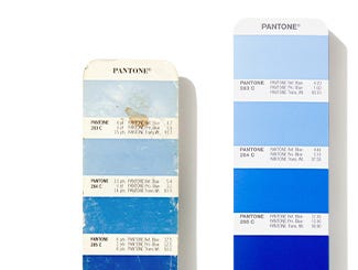
WHY SHOULD YOU UPDATE YOUR PANTONE GUIDES AND BOOKS?
Handling, light, humidity, and oil will cause colors to become inaccurate and you could be missing the latest market and trend-driven colors. How many colors are you missing?
SHOP TOOLS FOR