Pantone Announces Fashion Color Report Fall 2016
A Transporting and Transformative Canvas

CARLSTADT, N.J., September 10, 2015 – Pantone LLC, an X-Rite company and the global authority on color and provider of professional color standards for the design industries, today revealed the PANTONE® Fashion Color Report Spring 2016, a comprehensive overview of fashion designers’ use of color in their upcoming collections. Released to coincide with New York Fashion Week, the Spring 2016 PANTONE Fashion Color Report, one of two semiannual reports published for the fashion industry, features the top 10 colors for women’s and men’s fashions, along with designer sketches and inspirations. The complete report is available at pantone.com/Spring-2016.
Influenced by the world of art, new global doors opening, and the desire to disconnect from technology and unwind, designers this season have gravitated toward a palette that is first and foremost calming, and pays homage to the beauty of natural resources. The colors emerging in the Spring collections serve as vehicles that transport wearers to more tranquil, mindful environs which encourage relaxation first, followed by curiosity and exploration.
Designers were also inspired by the contrast of urban design and lush vegetation, leading to unexpected color combinations and collections reminiscent of architecture, travel and nostalgia. By creating looks that truly represent the world we live in, both constructed and organic, designers sought to awaken a sense of reflection, followed by playful escapism. Artists, many of whom are known for bold color usage and strong shapes and lines, played an influential role in this season’s styles – from Matisse, Picasso and Frank Stella to Esther Stewart and Sam Falls. With Cuba and other destinations south of the border top of mind, designers are playing with courageous color statements; coupling these vibrant hues with quieting, classic and more natural tones.
“The color palettes of this season transport us to a happier, sunnier place where we feel free to express a wittier version of our real selves,” said Leatrice Eiseman, executive director of the Pantone Color Institute®. “Yet with our culture still surrounded by so much uncertainty, we are continuing to yearn for balance by incorporating those softer shades that offer a sense of calm and relaxation.”
Colors shown on the runway also transcend cultural and gender norms. Vivid brights give way to excitement and optimism, though quiet stability prevails in this season’s palette. For Spring 2016 there are truly no perceivable distinctions in color choices between the men’s and women’s collections, both of which focus on a desire to breathe and reflect, then play.
The top colors for men’s and women’s fashion for Spring 2016 are:
- PANTONE 131520 Rose Quartz*
- PANTONE 161548 Peach Echo*
- • PANTONE 153919 Serenity*
- • PANTONE 19-4049 Snorkel Blue
- • PANTONE 12-0752 Buttercup
- • PANTONE 13-4810 Limpet Shell*
- • PANTONE 16-3905 Lilac Gray*
- • PANTONE 17-1564 Fiesta
- • PANTONE 15-1040 Iced Coffee*
- • PANTONE 15-0146 Green Flash
About the Spring 2016 Color Palette:
The soothing, calming nature of colors in the Spring collections are led by Rose Quartz, a persuasive yet gentle tone that conveys compassion and a sense of composure. Like a serene sunset or budding flower, Rose Quartz reminds us to reflect on our surroundings during the busy but lighthearted spring and summer months.
The fashion and design communities, and consequently, consumers, have been in love with orange for several seasons. Coming to the fore this Spring: Peach Echo, a shade that emanates friendlier qualities, evoking warmth and accessibility. Like the expanse of the blue sky above us, Serenity, comforts with a calming effect, bringing a feeling of respite even in turbulent times. A transcendent blue, Serenity provides us with a naturally connected sense of space. Playing in the navy family, but with a happier, more energetic context, the maritime inspired, Snorkel Blue implies a relaxing vacation and encourages escape.
While the majority of the Spring/Summer palette trends toward calmness, a few diversions from the theme emerge that offer a contrast. With Buttercup, designers reveal a shining beacon transporting its wearer to a happier, sunnier place. The high energy Fiesta is a harbinger of excitement, encouraging free-spirited exploration to unknown but welcoming locales.
As in most any season, the need for neutrals in the beige and grey family arises. The subtlety of the lilac undertone in Lilac Gray adds a distinctive edge to this classic gray shade. Iced Coffee is a transitional color that will take us through the season as another strong neutral. With its natural earthy quality, the softness and subtlety of Iced Coffee creates a stable foundation when combined with the rest of this season’s palette.
A shade of aqua that leans toward the green family, Limpet Shell is clear, clean and defined. Suggestive of clarity and freshness, its crisp and modern influences evoke a deliberate, mindful tranquility. Green Flash calls on its wearer to explore and escape the mundane, radiating an openness that combines with the rest of the palette in unexpected but serendipitous ways. The popularity of this brilliant hue is representative of nature’s persistent influence even in urban environments, a trend continuing to inspire designers.
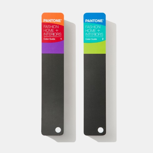
The colors featured in the semiannual PANTONE Fashion Color Report are culled from the PANTONE FASHION, HOME + INTERIORS Color System, the most widely used and recognized color standards system for fashion, textile, home and interior design. This August, PANTONE released 210 new colors to the system, the first time the company has added colors to its collection since 2011. The PANTONE Spring 2016 Fashion Color Report features several colors from the new additions. Each season, Pantone surveys fashion designers who will be showing collections at New York Fashion Week and other global shows to collect their feedback on prominent collection colors, color inspiration and color philosophy. This information is used to help create the PANTONE Fashion Color Report, which serves as a reference tool throughout the season for fashion enthusiasts, reporters and retailers.
*A new color introduced to the PANTONE FASHION, HOME + INTERIORS Color System in 2015
About Pantone and the Pantone Color Institute
Pantone LLC, a wholly owned subsidiary of X-Rite, Incorporated, is the global color authority and provider of professional color standards for the design industries. Pantone products have encouraged colorful exploration and expressions of creativity from inspiration to implementation for more than 50 years. Through the Pantone Color Institute, Pantone continues to chart future color direction and study how color influences human thought processes, emotions and physical reactions. Pantone furthers its commitment to providing professionals with a greater understanding of color and to help them utilize color more effectively. Always a source for color inspiration, Pantone also offers designer-inspired products and services for consumers. More information is available at www.pantone.com. For the latest news, trends, information and conversations, connect with Pantone on Facebook, Twitter, Pinterest, and Instagram.
About X-Rite
X-Rite, Incorporated, is the global leader in color science and technology. The company, which now includes color industry leader Pantone, develops, manufactures, markets and supports innovative color solutions through measurement systems, software, color standards and services. X-Rite’s expertise in inspiring, selecting, measuring, formulating, communicating and matching color helps users get color right the first time and every time, which translates to better quality and reduced costs. X-Rite serves a range of industries, including printing, packaging, photography, graphic design, video, automotive, paints, plastics, textiles, dental and medical. For further information, please visit www.xrite.com.
PANTONE®…Make It Brilliant.
- # # # -
PANTONE® and other Pantone trademarks are the property of Pantone LLC. All other trademarks are the property of their respective owners. © 2014. All rights reserved.
![팬톤 포뮬러 가이드 코팅, 비코팅 l GP1601B[PANTONE FORMULA GUIDE l Coated & Uncoated]](http://pantone.kr/web/product/medium/202211/4a7c973e9ca5908d5fb19fef3280e56b.jpg)